
My Ultimate Guide to Research Presentation Slide Preparation
Some of you are going to hate this.

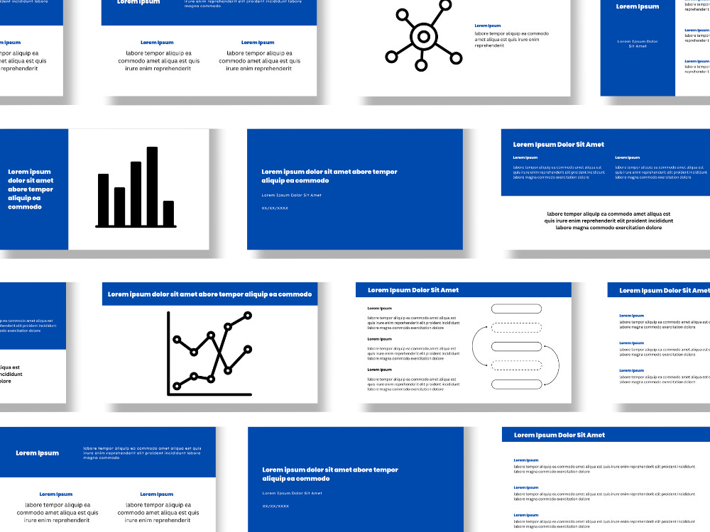
Here’s a set of slides:1

You can’t tell from the image, but every time the presenter switches slides, the new text twizzles onto the page more gracefully than Adam Rippon at the 2018 Winter Olympics. The color scheme matches his tie.
It’s a pretty set of slides.
And I hate it.
When you’re presenting your research, your words are the presentation. Not your slides.
Slides are there to perform five key functions:
Maintain the pace of the presentation.
Remind you of what you wanted to say through carefully placed keywords.
Create and maintain audience focus on the specific topic you’re discussing.
Remind the audience what you’re talking about if they briefly stop paying attention.
Show your data.
That’s it. That’s all your slides should be doing.
If you come to a conference or seminar with pretty, overly designed, visual-heavy slides like the ones in the example above, you better give THE BEST talk I have ever heard. Because that’s the only way I’m not coming away from that talk thinking, “Imagine how much better that could have been if s/he’d spent those hours practicing the talk instead of designing those slides.” If I see fancy slides before you start your talk, I’m potentially going to be immediately biased and suspect your speaking skills aren’t great and that you’re trying to use the slide design and information written on the slides to carry them. I’m not even (very) judgmental. It’s just something I’ve observed quite frequently in real-world settings…
Fancy slides won’t carry a mediocre presentation. And even if you do give the best talk the audience has ever heard, those slides might not have the effect you think.
Fancy Slide Design Reduces the Retention of Information
Humans are bad at retaining information. We don’t do well with internalizing two sets of stimuli at the same time.
If you asked 10 attendees to recreate your presentation immediately after you presented it, it’s unlikely that they’d be able to cover every point between them. Ask them the following week, and they might remember three out of five of the take-home messages.
One way to increase information retention within your audience members is to remove as many distractions as possible while you’re presenting. You have the key messages. The focus should mainly be on your words at all times. This is especially important in the early sections of a talk (which is where people tend to throw in a lot of unnecessary visual components on their slides) because if someone is staring at your slide wondering how to recreate that cute DNA graphic in Canva while you’re explaining the fundamental basis of your study, when it comes to the data section, they’re not going to have a clue what you did or why and you might as well be talking to your cat.
When communicating complex ideas, we have to consider the importance of giving the audience the mental space to consume what we’re communicating. Clarity is the most important thing when you’re in a conversation (which a presentation is, albeit a very one-sided one). Sometimes, we forget to think about exactly how people process information when giving it. Having complex and “pretty” slides splits the audience’s attention between what you’re saying and the slides, and this will result in them remembering a whole lot less of what you’ve said.
When what you’re saying is what you want the focus to be on, you need to have plain slides. Otherwise, in a year’s time, the audience might remember the fancy slides and absolutely nothing about what you presented to them.
“Less is More” Doesn’t Just Mean Plain
Here are 5 things to remove from your slides immediately:
Any visual element (decoration, background) that is purely there to make the slide look ‘nice’.
Elaborate color schemes (your slides aren’t wallpaper).
Nonstandard fonts.
Any image that you are not going to talk about or that doesn’t add to the audience’s understanding of what you’re saying.
Any text animation that doesn’t serve a specific purpose.
The next thing to remove will take a little more time: most of the text.
Why will that take more time? Because you need to develop your talk first and know exactly what you’re going to say and when to determine how much text needs to be on your slides and which slides to put it on.
Fun fact: most people don’t actually enjoy working with me on their presentations because I delete half their slides, cut out most of their text, and focus almost entirely on what they’re going to be saying instead of what’s on the screen behind them. But if you’ve ever tried to train for a 10K, you probably already know that things that make you better aren’t necessarily things you’re going to enjoy (although… maybe I just hate running), and I promise you my method will make you a better presenter. That’s why I’m giving it to you here.
How To Prepare Your Research Presentation Slides
(For optimal audience focus and information retention)
Step 1: Plan out and practice your talk.
You can use slides for outlining purposes to help you set the pace and make sure your talk fits in the allotted time, but these won’t be your presentation slides. I personally use handwritten index cards for this, but if you want to use a PowerPoint, go ahead. Write out your talk if you need to. The key here is to know what you’re saying where so that you can design the slides around what you are going to say as opposed to designing what you’re going to say around what’s on your slides.
Step 2: Break down each section of your planned talk into slides
These also won’t be your final slides (sorry). The goal here is to get the information onto slides so you can visualize your talk and use what you’re going to say to optimize your slide design. Have one slide per section (intro, background, aims, etc.) then add what you’re going to say to each one.
Step 3: Evaluate how many slides you need and divide the information between them
Having too much on one slide isn’t good, but neither is splitting your information across five slides and then having to scroll back and forth among them because you talk about something later on that you need to refer back to a previous slide for. Make sure that all the information you’re going to talk about in a particular section is on a single slide. When you advance to the next slide, you should no longer be referring back to previous ones. Flipping back and forth is distracting. You’ll lose your audience, and you might lose your place in your presentation as well.
Where you have a lot of information and you’re not referring back to any of it later, give each point its own slide so that you don’t have an overwhelming amount of text on any of them.
Step 4: Cut out as much text as possible
Now you have a set of slides with information on them that corresponds to what you are going to be talking about and when, you can start thinking about the text you need to have on the screen and the text you want the audience to see.
The text on your slides isn’t really for the audience to read. It’s there to help you pace your speaking, keep the audience’s attention by focusing/refocusing them on the areas you’re currently speaking about, and to act as a little roadmap to reorient the person who just switched off for a minute to answer an email (there will always be one. Sometimes, it’s me.)
Break the text up into sections that will help you pace your talk. For example, if you’re going to spend three minutes talking on one slide, having three sections on the slide can help you keep to a minute per section. These also help you orient the audience and keep them focused. When you move between the sections, you can take a second to point your laser pointer (or excessively long stick or whatever it is you’re using) at the next point to refocus everyone and show a clean transition without having to say, “Now we’re moving on to XYZ.”
Additionally, you’ll want to retain keywords that remind you of what you wanted to say for each section. Having a cue word as the first word in each bullet point can help avoid any awkward silences while you try to remember what the hell you were going to say next.
As for how much text… For introduction, background, results summary, discussion etc. pages, I’d recommend no more than the following:
Descriptive title
Short subtitle per subsection (1-5 words)
No more than 2 sentences under each subsection.
For figure slides: Just a descriptive title for the figure. No interpretation. No legend. You’ll be giving the audience that information with your words. They don’t need to read it.
Step 5: Add your images
You might want to have images on your introduction, background, and conclusion/summary slides, but don’t be tempted to throw in a pretty picture that’s just there for aesthetics (your audience gets enough aesthetics from Instagram). Every single image you place in your presentation should be an image that you’re going to specifically talk about and/or walk the audience through in detail. For your data slides, break complex figures up so that every single thing on them can be easily seen on the slide and make them as big as possible (make sure the resolution is high enough—nobody wants to look at pixelated data). I said it in the previous section but will say it again here… only the figure and a descriptive title belongs on these slides.
Step 6: Practice your talk with your slides
Practice it as much as humanly possible. As you do so, you’ll notice areas where you might need to move sections around, combine points onto one slide, divide them into two slides etc. You’ll know you’re done with practicing when you can give your talk without feeling the need to mess with any of the slides.
Step 7: Format your finalized slides
Transfer your slides onto your university’s template or build a very basic, nondistracting theme with basic fonts and a simple color scheme.
“But I prefer looking at the first set of slides!”
That’s OK. The audience might prefer looking at those, too. But that’s not the point of a presentation.
You don’t want the audience to look back on your talk and think, “Nice slides!”.
You want them to think, “What a great study!”
These slides are from the “Blue White and Teal Modern Scientific Research Business Presentation” template in Canva and were not made by me. They would probably be just fine for a research business presentation, but that’s not what I’m talking about here. In fact, I blame sites like Canva, Envato etc., for excessive research presentation slide overdesigning to a certain extent, along with all the online digital marketing content, because they’re everywhere and many people just fundamentally do not understand the difference between slides to use while giving a presentation and slides you make for a business or grant app pitch deck that will likely be read without any accompanying talk. Those latter ones can be loaded with information that does not need to be anywhere near a slide you’ll be standing in front of talking about.